Background
Sexual health education is failing globally. Only 34% of schools worldwide provide accurate, comprehensive sex ed (UNESCO, 2023), while stigma prevents open conversations at home. The result? Over 40% of teens encounter harmful myths online (Journal of Adolescent Health, 2023), often encountering misinformation. increasing risks of STIs, mental health struggles, and unsafe practices.
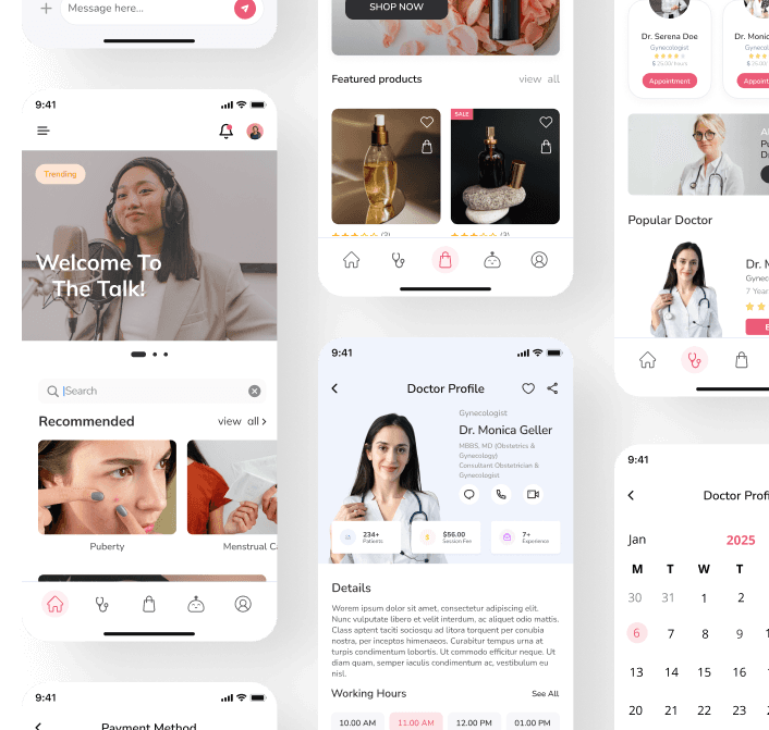
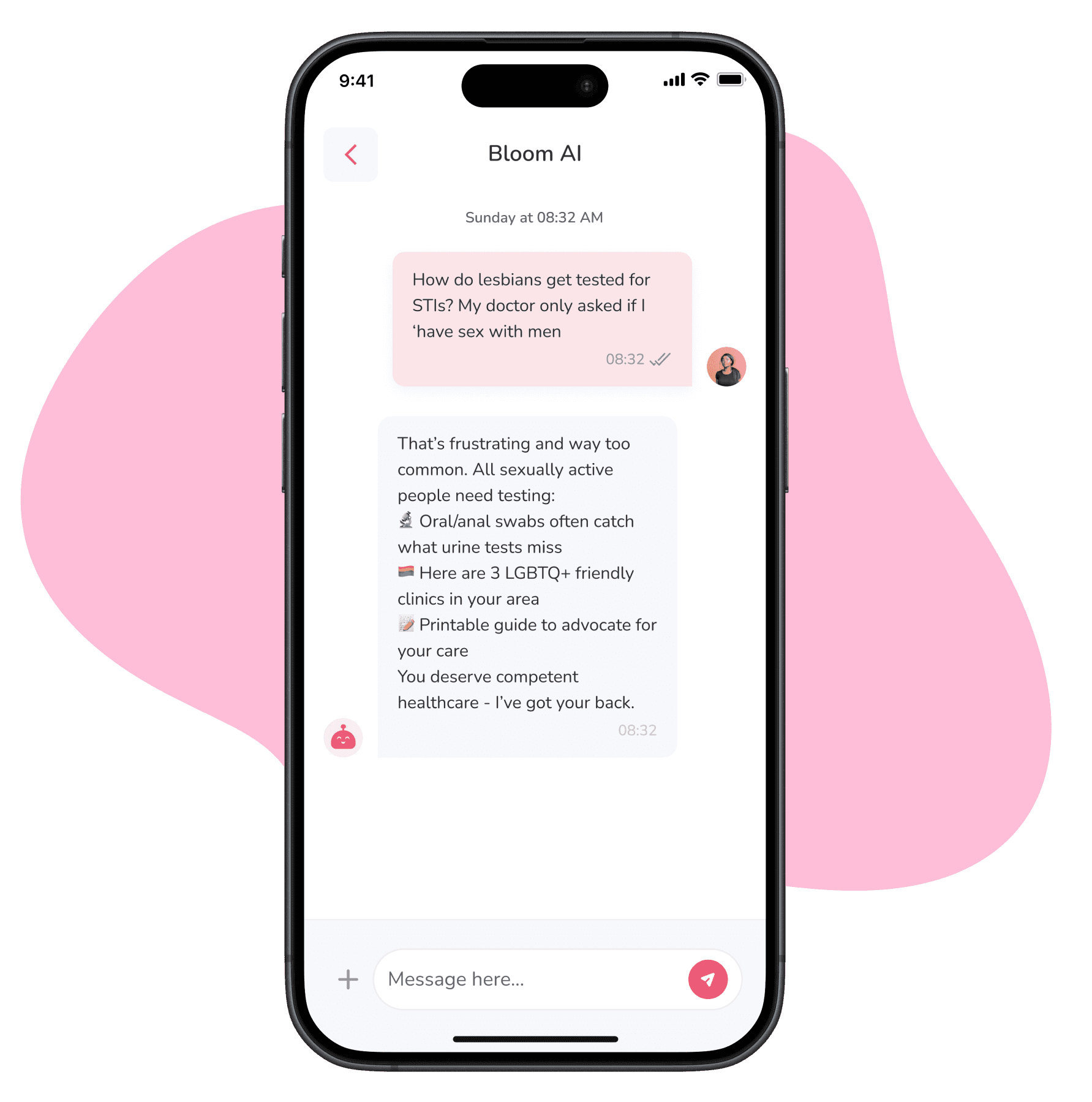
We designed Bloom to solve the sexual health education crisis through thoughtful UX - crafting a platform that delivers articles, engaging video lessons, and an AI chatbot that answers questions without judgment. Then we went further: one-tap doctor consults and discreet access to products, creating a space where knowledge leads directly to care. For millions of people who never got proper sex ed, Bloom’s design makes life-changing information feel safe and straightforward.
Problem
Sex Ed is Failing a Generation - Leaving Millions Without Vital Knowledge
Misinformation and shame around sexual health leave 90% teens unprepared to make safe decisions—while existing solutions are either too clinical, impersonal, or ignore cultural barriers.
crafted solutions

Research
The first step in this process was to explore the challenges people face regarding sex education and sexual health through both primary and secondary research.
Primary research
Interviewing a doctor to understand medical perspectives on sexual health education.
Speaking with a teacher to learn about how sex education is taught and the challenges students face.
Engaging with young adults and individuals to understand their concerns and gaps in knowledge.
Talking to app users and potential users about their needs in a sex education platform.
Secondary research
Researching sexual health trends, misconceptions, and common concerns through articles and reports.
Reading online discussions and experiences shared by people regarding sex education and healthcare access.
Insights
It became immediately clear to us that sex education is a complex and often overlooked field, with many gaps in knowledge and accessibility. Every piece of research we conducted revealed new challenges, but some key issues stood out consistently.
Lack of Standardized Education – Sex education varies greatly across regions, with some places offering comprehensive, inclusive education while others provide little to no information.
Stigma & Discomfort – Many feel uneasy discussing sexual health, leading to misinformation.
Limited Digital Accessibility – While many young people turn to the internet for answers, reliable and engaging educational resources are not always easy to find. Exclusion of LGBTQ+ Topics – Many curricula fail to address diverse identities and relationships.
Exclusion of LGBTQ+ Topics – Many curricula fail to address diverse identities and relationships.
Healthcare Barriers – Fear of judgment and lack of confidentiality deter young people from seeking help.

Brainstorming & Ideation
Based on my research, users struggle with stigma, misinformation, and a lack of engaging sexual health resources. Many feel uncomfortable seeking help, finding trusted products, or knowing when to consult a doctor. In response, I brainstormed relevant ways to enhance the platform's seamless and user-friendly experience. I focused on features that ensure accessibility, engagement, and a judgment-free experience.
early wireframes
Here’s a look at the early design stages. I worked on making the platform easy to use and understand, focusing on a clear, approachable flow.






I spent a lot of time looking for the most efficient way to deliver information that feels approachable and trustworthy and not too overwhelming or distant. This led to incorporating features like clear navigation, interactive elements, and a more intuitive layout to enhance the user experience.




Improved the navigation bar to make everything easier to find, especially for first-time users.
Cleaned up the content layout to make it less cluttered and more user-friendly.
Focused on a better visual hierarchy so the most important information stands out without overwhelming the user.
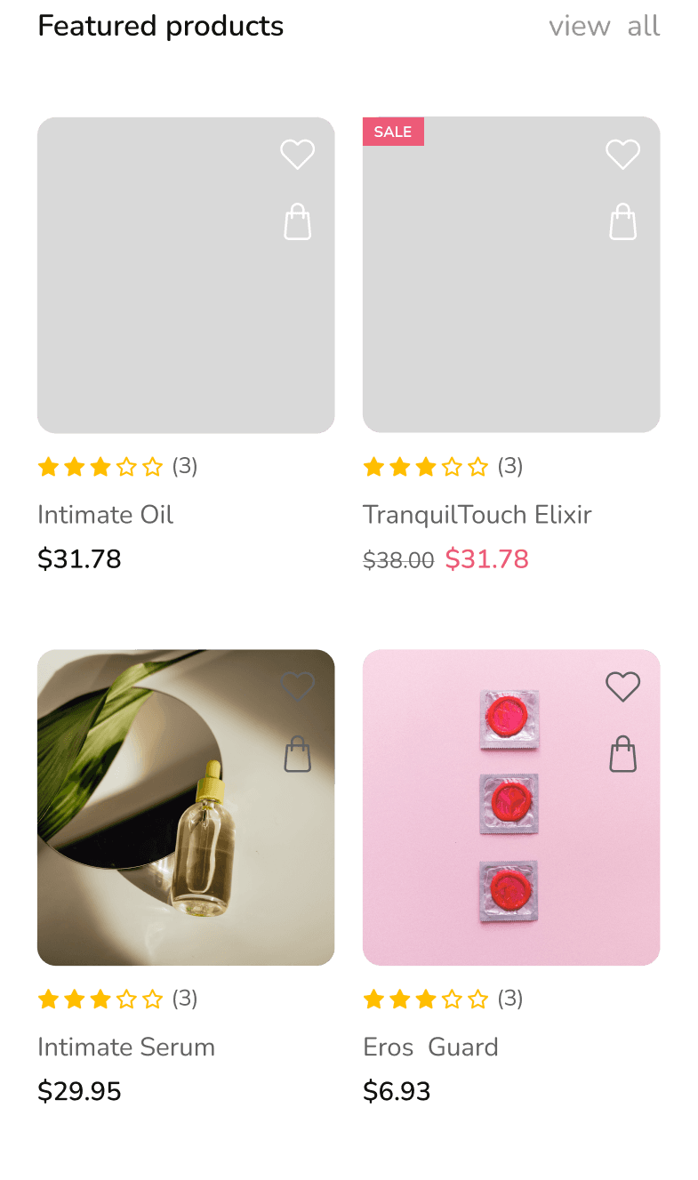



Then I refined everything further into high-fidelity designs:
crafted solutions
Trusted Educational Content
Reliable Information – Access well-researched content from trusted sources.
Engaging Videos & Articles – Learn through credible, high-quality media.
Stay Informed – Get the latest insights in a clear and accessible format.

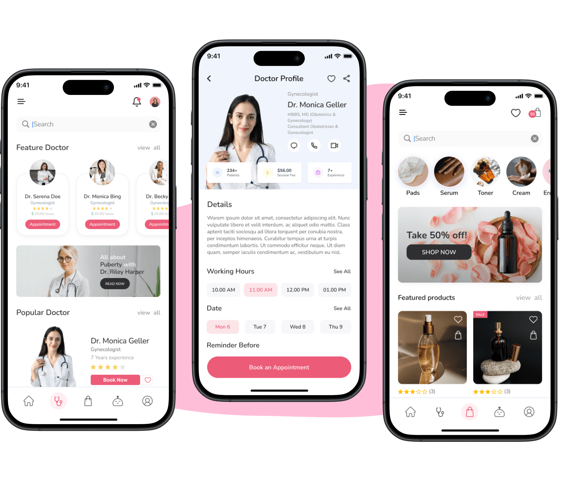
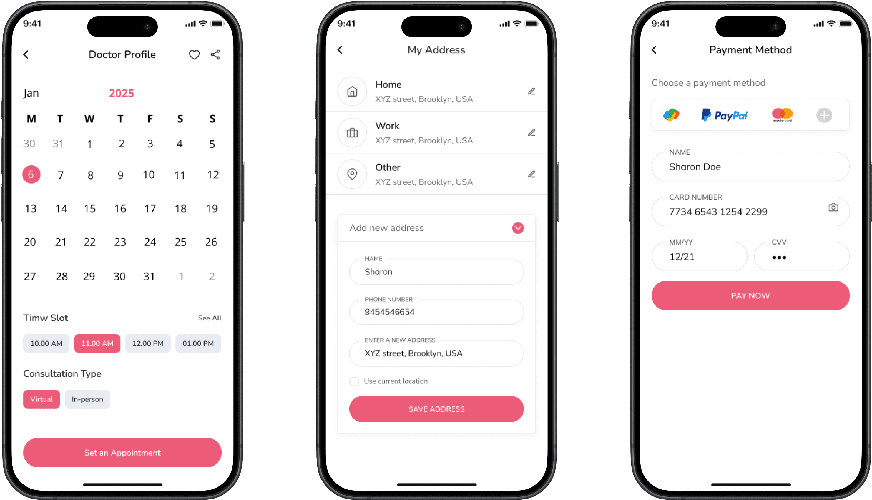
Comprehensive Sexual Health: Shop & Consult in One App
All-in-One Convenience – Shop for sexual health products and book doctor consultations in one place.
Trusted & Discreet – Get high-quality products and private consultations with certified doctors.
Seamless Experience – Easy browsing, secure payments, and quick appointment booking within the app.
Design System
Palette
Since this platform focuses on sexual health education and support, I wanted a color palette that feels approachable, empowering, and inclusive. The chosen colors create a balance of warmth and clarity, ensuring users feel comfortable engaging with the content while maintaining a professional and modern aesthetic.
Primary
Secondary
Typography
For the platform’s typography, I chose Nunito for its modern, friendly, and highly readable nature. Its rounded letterforms create a welcoming and approachable feel, making complex or sensitive information easier to digest. Nunito also maintains a clean and professional look across various screen sizes, ensuring a seamless reading experience for users.
ABCDEFGHIJKLMNOPQRSTUVWXYZ
ABCDEFGHIJKLMNOPQRSTUVWXYZ
1234567890
User testing
I created a click-through prototype in Figma to understand how users interacted with the platform. Over two weeks, I tested with 20 participants, including individuals seeking sexual health resources and medical professionals. I developed a structured testing plan with key tasks, observed users via screen sharing, and gathered feedback on clarity, accessibility, and ease of navigation. The insights were both validating and eye-opening, leading to key refinements in the final design. Seeing users engage with the platform and hearing their thoughts reinforced my goal of making sexual health education more accessible and judgment-free.
What Could Have Been Better?
While the platform successfully provides accessible and judgment-free sexual health education, there’s always room for growth. Future improvements could include a community forum that could create a space for users to connect and support each other, making them feel less isolated in their learning. Incorporating live podcasts with experts would allow for real-time, relatable conversations, making the content even more engaging. Additionally, interactive quizzes could help users retain key information in a fun and meaningful way. These improvements would enhance user interaction, making the platform even more engaging and informative.
reflection
This project was a valuable learning experience, especially since it focused on sexual health education, a domain I hadn't designed for before. It taught me the importance of balancing sensitivity with clarity, ensuring that users felt comfortable engaging with the content while also delivering accurate, trustworthy information.
At first, I felt overwhelmed by the complexity of addressing stigma and misinformation, but through research and refining my user personas, I gained more clarity. I realized that trying to solve every issue at once wasn’t the best approach; instead, focusing on creating a simple, approachable experience made all the difference.
The ideation and wireframing phases were challenging as I sought the right balance between comprehensive content and ease of use. Iterating on the design helped me improve both functionality and tone, making the platform more user-friendly and engaging.
While I’m proud of the final outcome, I wish I had more time for further testing and to explore features like community forums or live sessions. Overall, this project reinforced the importance of empathy in design and its potential to make a meaningful impact on sensitive topics.
4o mini