Confidentiality Note
Some details in this case study have been modified or omitted due to confidentiality agreements. The visuals and descriptions focus on design decisions and process rather than sensitive business data.
Background
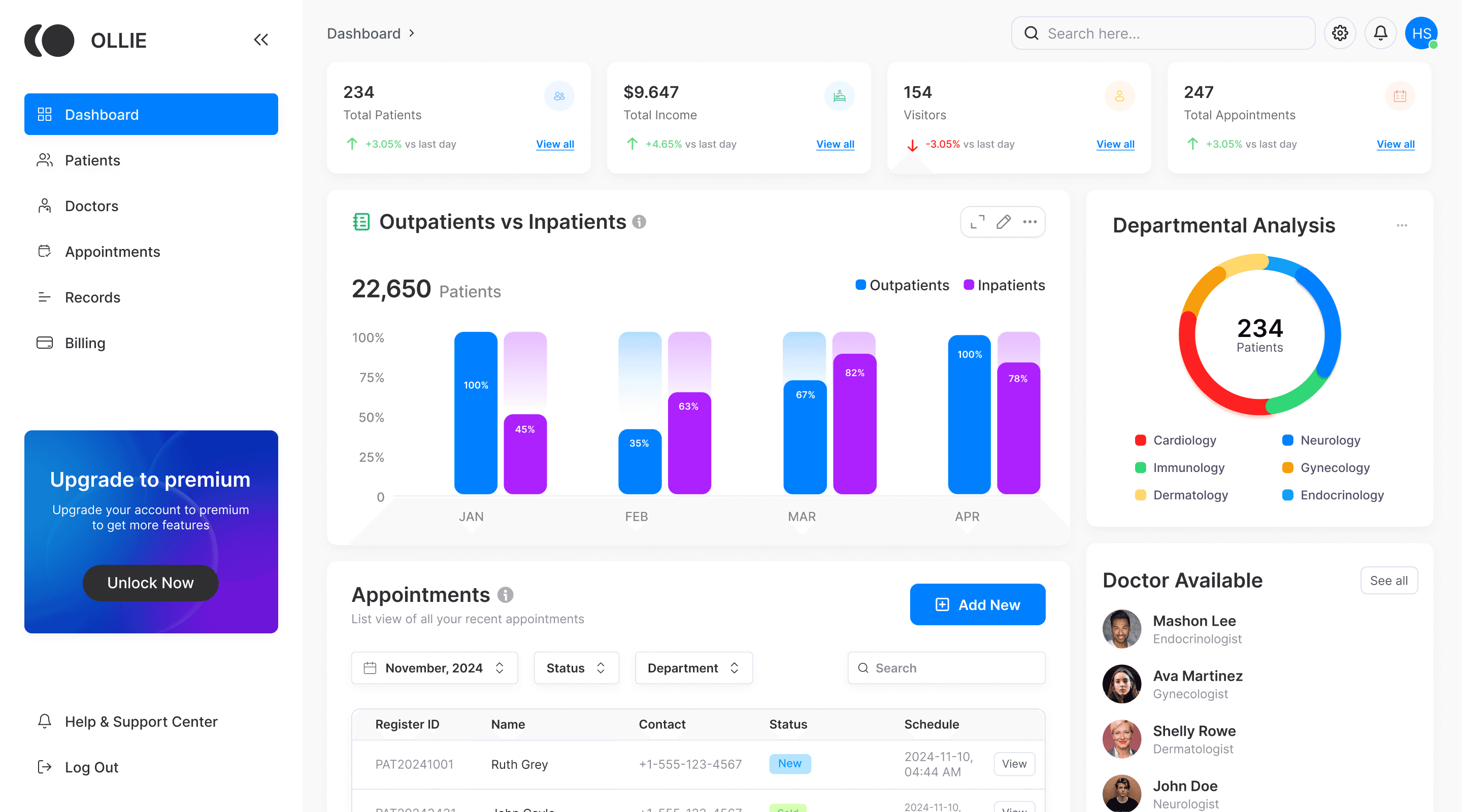
As part of my company’s initiative to develop membership portals for various industries, I was tasked with designing an admin-side healthcare dashboard to streamline hospital management. The goal was to create an intuitive interface for administrators to monitor key metrics, manage patient data, and track appointments efficiently.
Problem
Through user research, we discovered the problems of low data visibility, inconsistent workflows, and inefficiencies in patient management. Important information—like patient records, doctor schedules, and appointment statuses—was scattered across different places, making it hard to find what they needed quickly. Without a clear, centralized view, even simple tasks became time-consuming, and staying updated in real-time was a constant challenge.
Goals
Simplify access to critical patient and hospital data
Make patient records faster to find and update
Help admins quickly understand trends and key metrics
Reduce clicks and confusion in daily workflows
Research & Insights
To understand how hospital staff manage patient information and appointments on a daily basis, I conducted user interviews with individuals in different roles, including a hospital receptionist, an admin staff member, and a nurse. I asked them about their most-used data, what slows them down in current systems, and how they prefer key information to be displayed. Their feedback helped shape the overall structure, prioritization, and flow of the dashboard.
Brainstorming & Ideation
Based on my research, I found that hospital staff often struggle to locate the most-used information quickly—especially patient history, appointment details, and real-time visit statuses. They also need easy access to patient health metrics and contact details without jumping between screens.
With this in mind, I brainstormed what types of information would enhance each screen and support their daily workflows. I grouped ideas into three core areas:
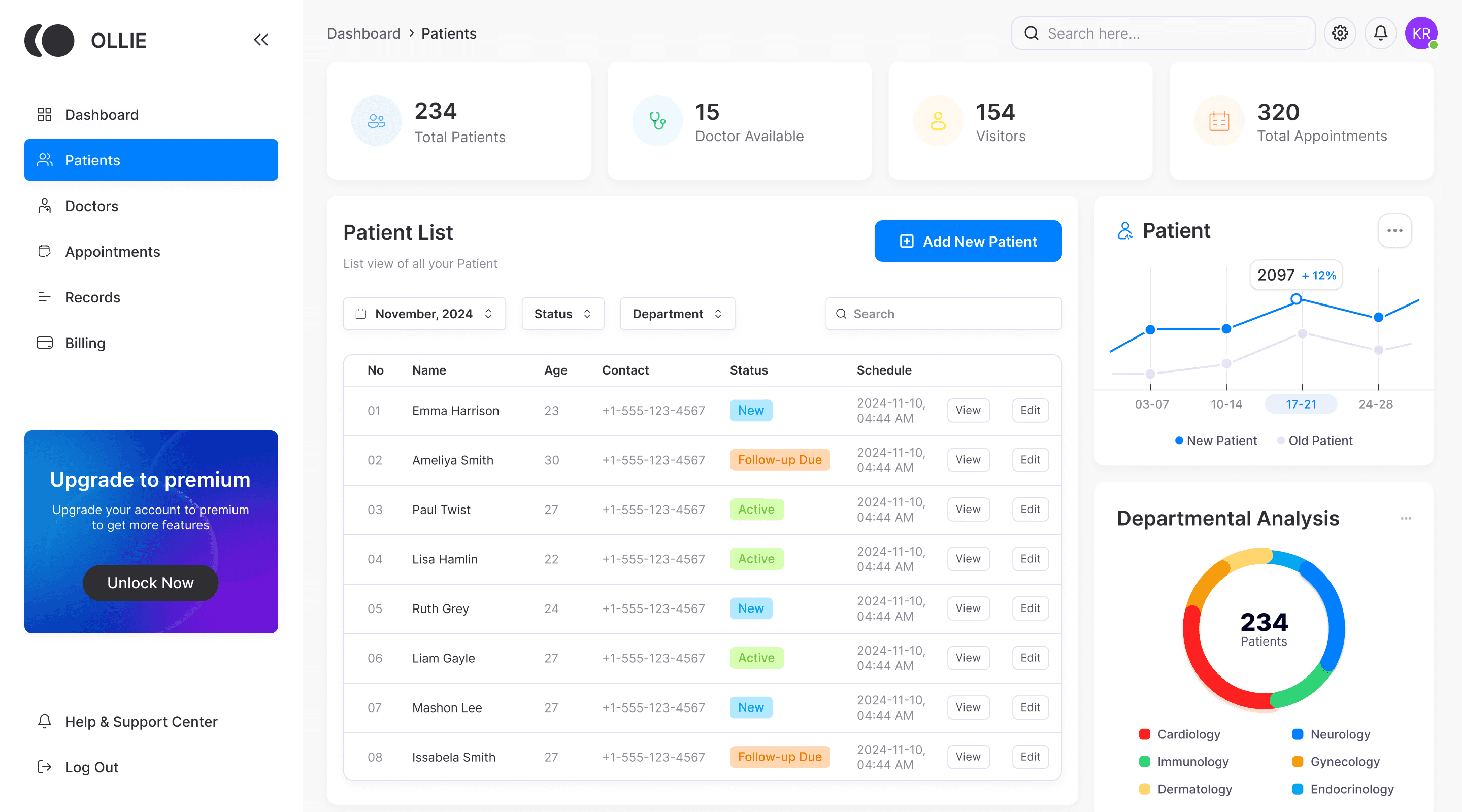
2. Actionable Data (Patient List)
A searchable, filterable patient list enables efficient management and quick access. Color-coded statuses, action buttons, and patient type tracking (new vs. old) support better prioritization and follow-ups.
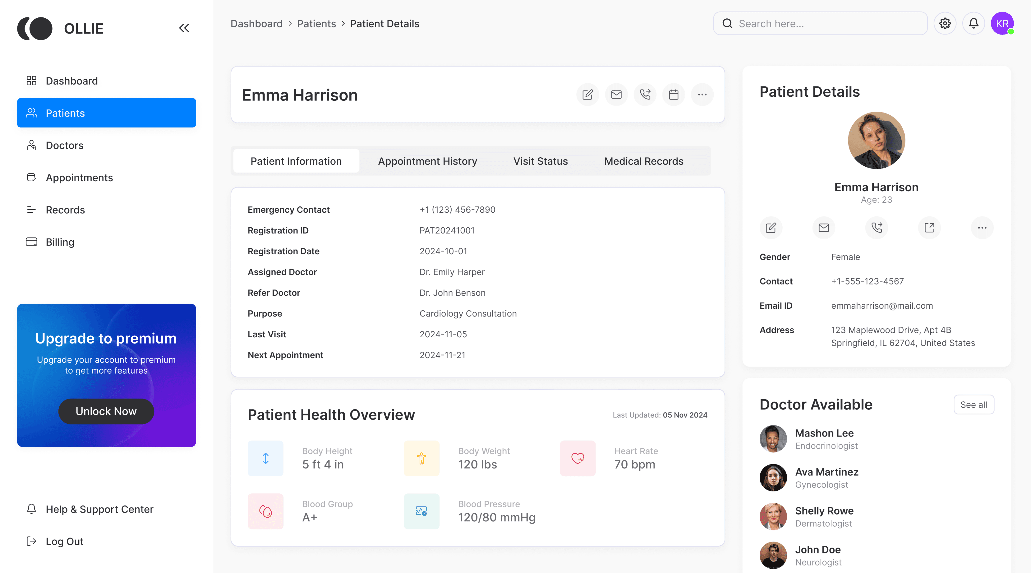
3. Deep Dive Info (Patient Detail Page)
Organized sections for medical records, appointment history, visit tracking, and health vitals—along with patient profile details like contact info and address.
After crafting a clear design system and reframing our approach, i created the layouts into high-fidelity screens with real data, clear structure, and focused interaction. Each section was designed to support quick decision-making, reduce cognitive load, and streamline day-to-day hospital operations.