
Where Work Meets Wander
Where Work Meets Wander
LOGO DESIGN | BRANDING
LOGO DESIGN | BRANDING
“Where Work Meets Wander”
“Where Work Meets Wander”
CONCEPT OVERVIEW
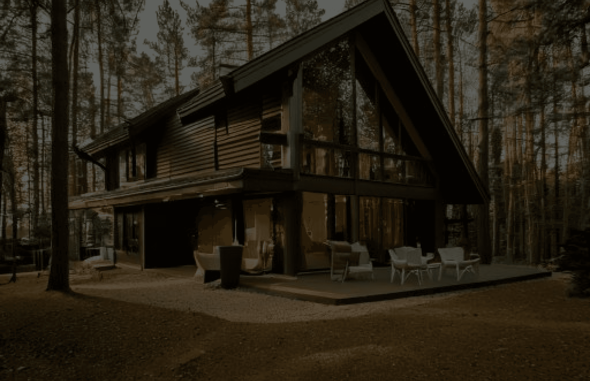
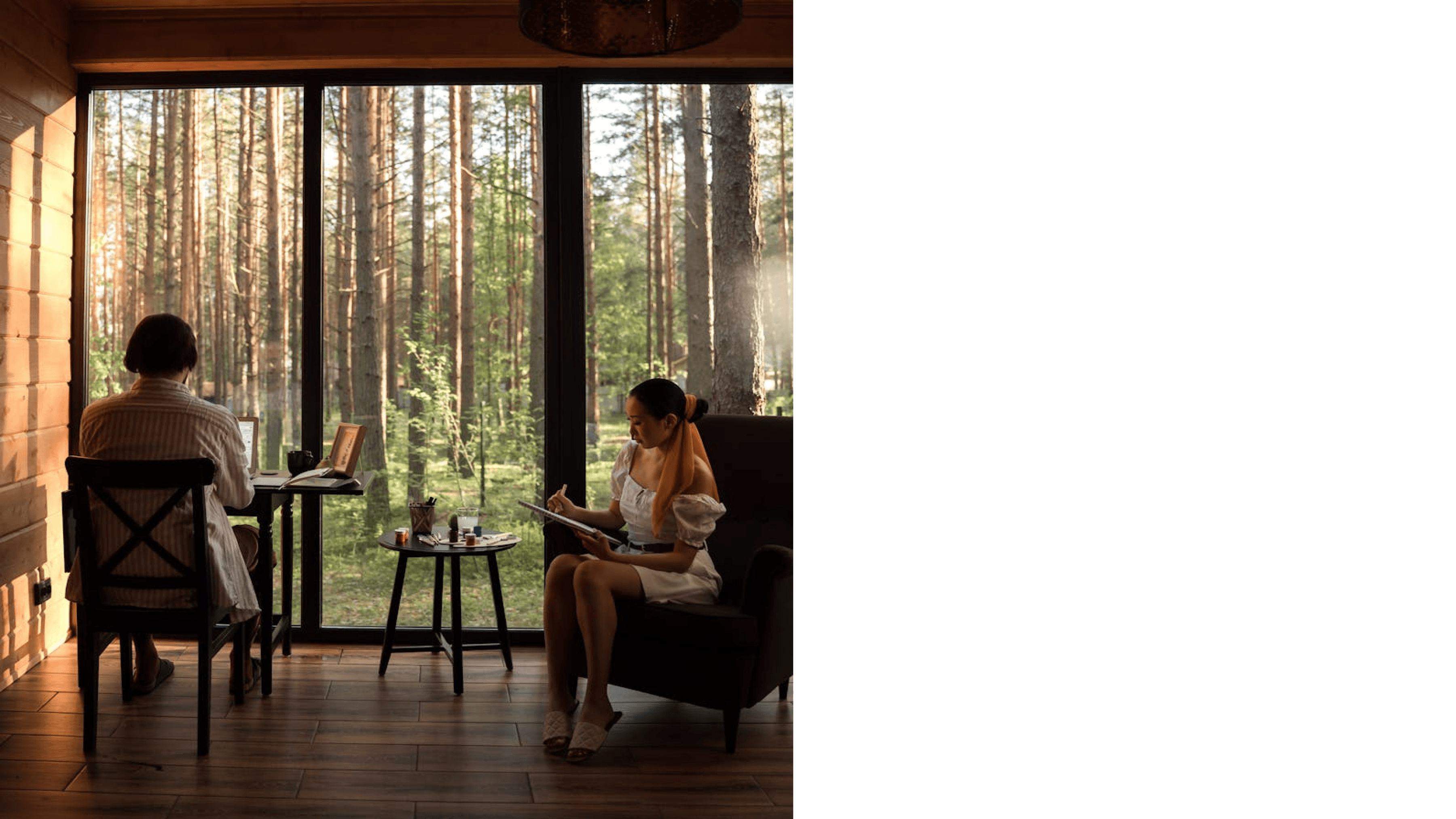
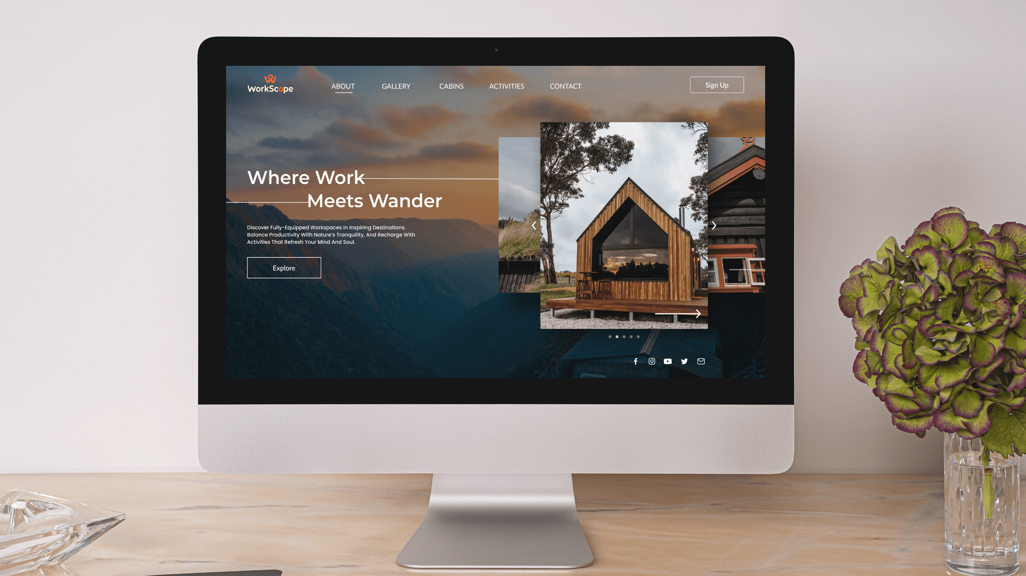
Workscape offers fully-equipped workspaces in serene locations like mountain cabins and lakeside retreats, tailored for freelancers and remote workers. These spaces provide seamless internet access, ergonomic furniture, and a reliable power supply, ensuring professionals can work efficiently while embracing the tranquility of nature.
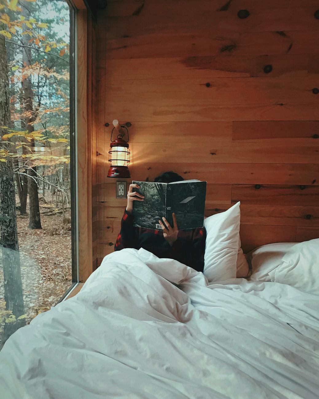
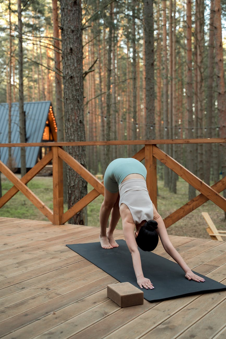
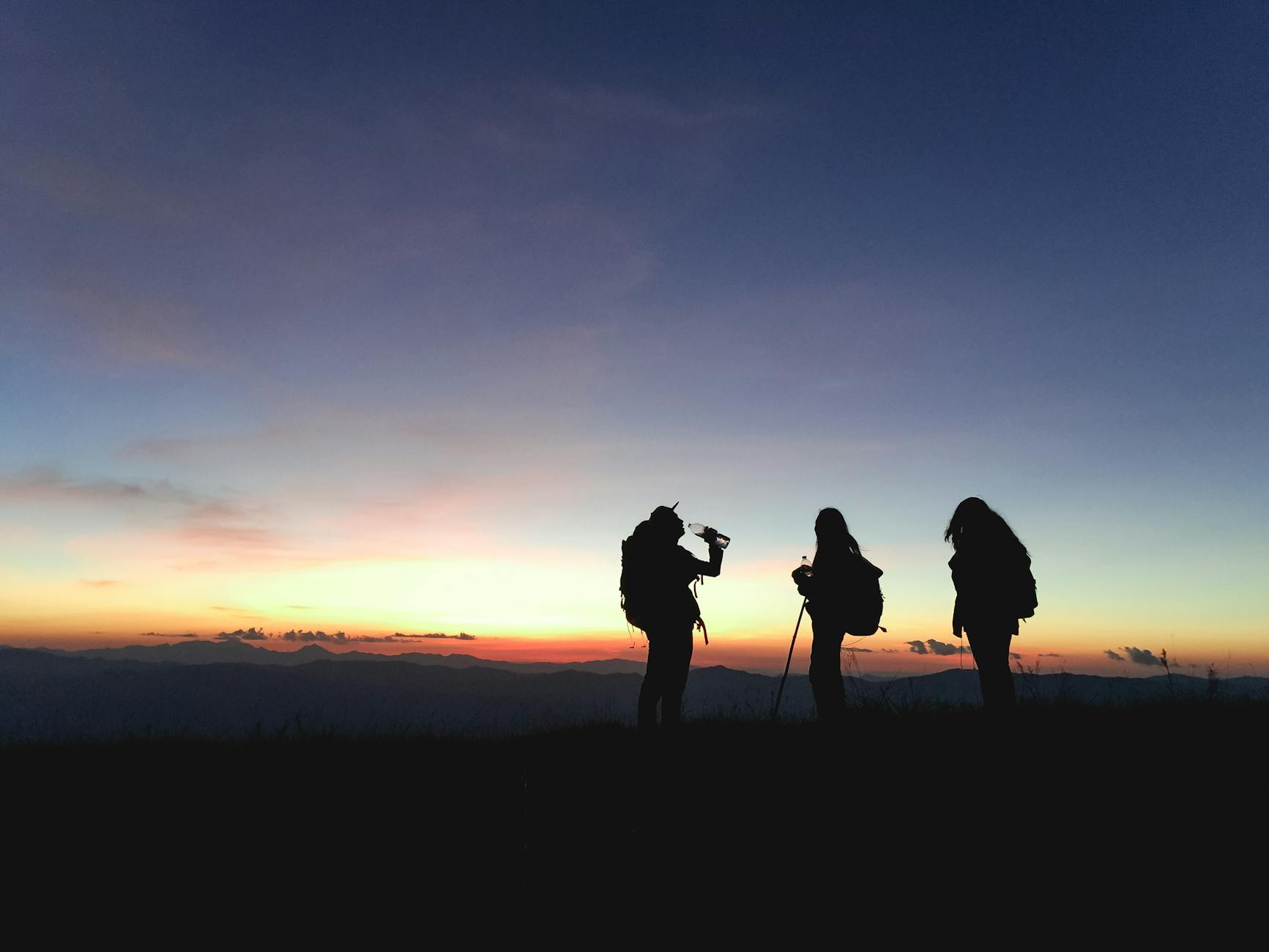
During breaks, individuals can recharge with activities like hiking, exploring new spots, or engaging in fun and relaxing experiences. By seamlessly combining functionality with natural inspiration, Workscape empowers professionals to thrive in harmony with their surroundings.
Workscape offers fully-equipped workspaces in serene locations like mountain cabins and lakeside retreats, tailored for freelancers and remote workers. These spaces provide seamless internet access, ergonomic furniture, and a reliable power supply, ensuring professionals can work efficiently while embracing the tranquility of nature.
During breaks, individuals can recharge with activities like hiking, exploring new spots, or engaging in fun and relaxing experiences. By seamlessly combining functionality with natural inspiration, Workscape empowers professionals to thrive in harmony with their surroundings.
THE CHALLENGE
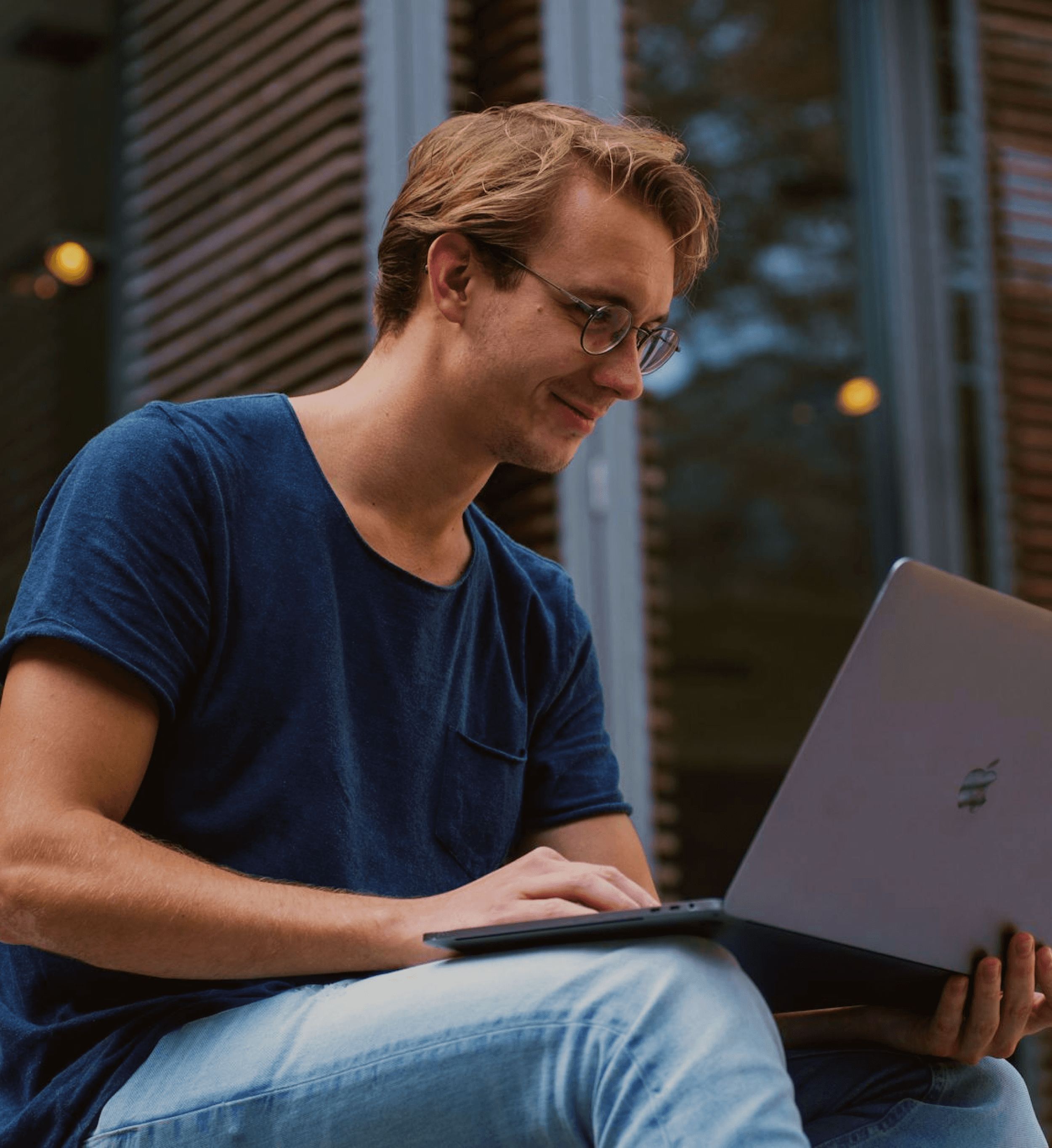
How might we design a workspace experience that balances productivity with well-being? Many remote workers struggle with isolation, distractions, and uninspiring environments. Workscape aims to solve this by offering fully equipped, aesthetically pleasing workspaces in stunning natural locations—be it a cozy mountain cabin, a beachfront hut, or a tranquil forest retreat.
How might we design a workspace experience that balances productivity with well-being? Many remote workers struggle with isolation, distractions, and uninspiring environments. Workscape aims to solve this by offering fully equipped, aesthetically pleasing workspaces in stunning natural locations—be it a cozy mountain cabin, a beachfront hut, or a tranquil forest retreat.
MY PROCESS
Research & Inspiration – I dived into understanding the pain points of remote workers, researching competitors like WeWork and Selina, and exploring how nature influences productivity.
Brand Identity – Workscape needed a visual identity that felt warm, modern, and inviting. I played with earthy tones, clean typography, and an organic yet structured logo.
Research & Inspiration – I dived into understanding the pain points of remote workers, researching competitors like WeWork and Selina, and exploring how nature influences productivity.
Brand Identity – Workscape needed a visual identity that felt warm, modern, and inviting. I played with earthy tones, clean typography, and an organic yet structured logo.
Where Work Meets Wander
Where Work Meets Wander

Where Work Meets Wander
Where Work Meets Wander
#F45B28
#003049
#2F2F2F
#FFFFFF
#FDF0D5
BRANDING & VISUAL IDENTITY
I wanted Workscape to evoke a sense of calm, inspiration, and adventure. The branding revolves around:
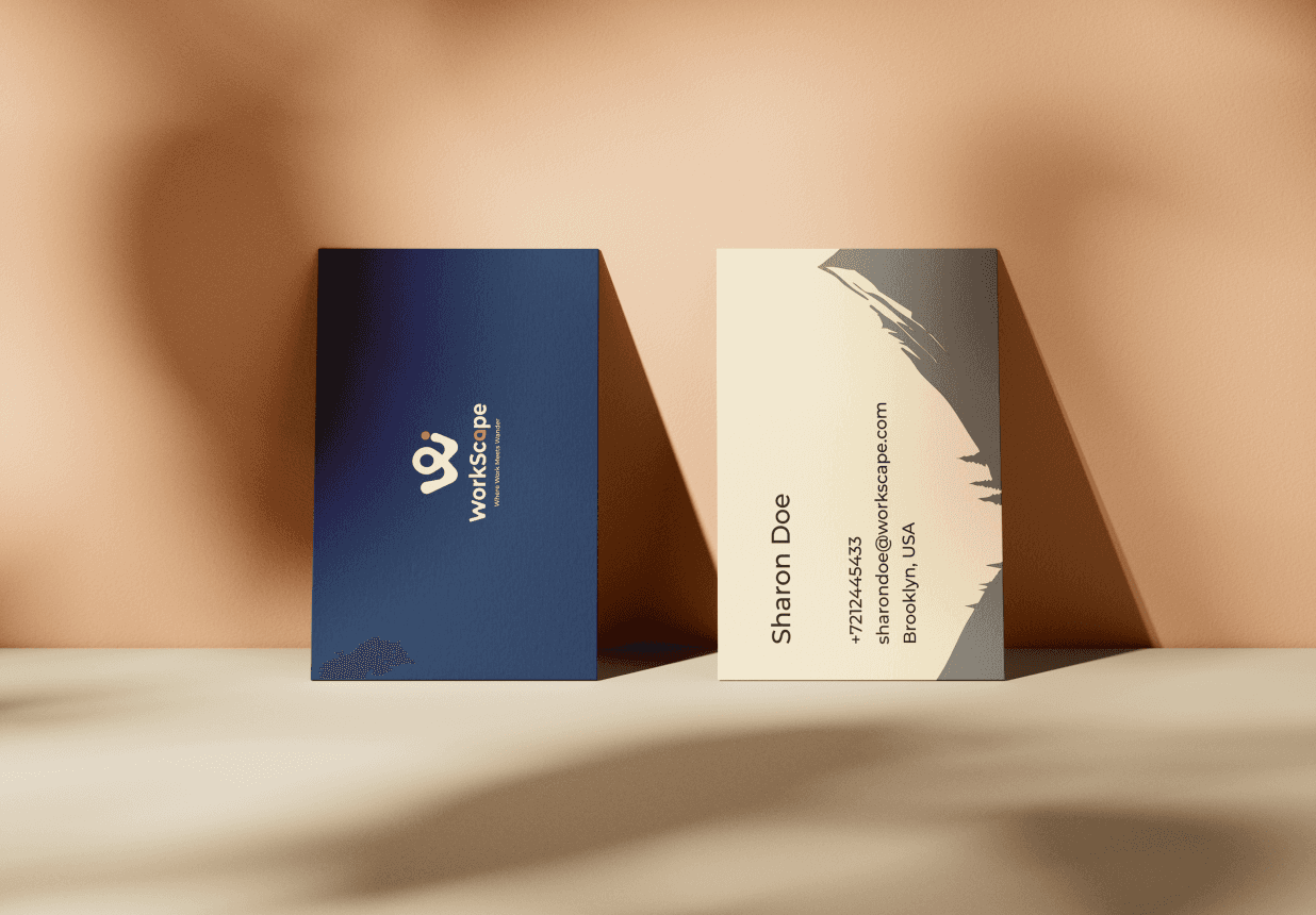
Logo – The Workscape logo, featuring a stylized "W" and a location pin, reflects the brand’s focus on productivity in inspiring locations. The "W" symbolizes work, while the location pin represents unique, serene workspaces. This design evokes exploration and balance, creating a strong, memorable identity that aligns with Workscape's mission to empower remote professionals.
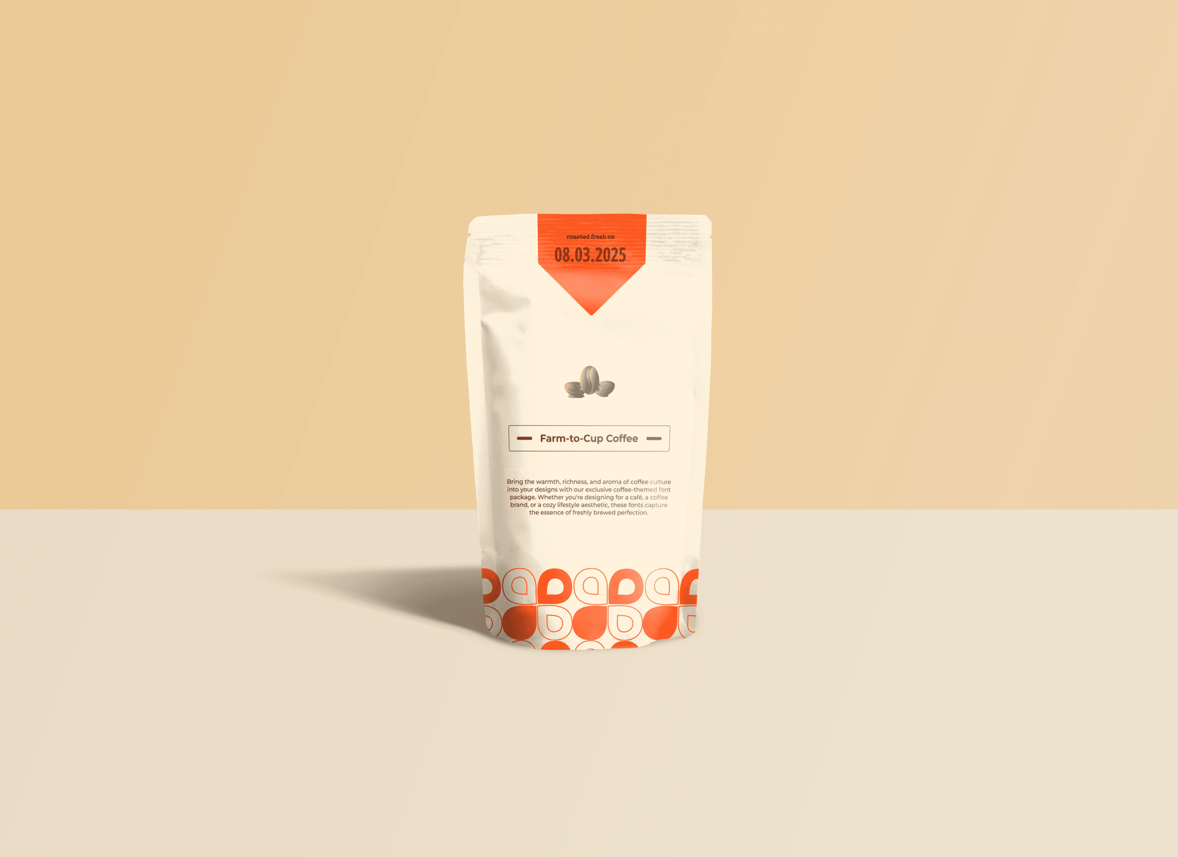
Color Palette – A mix of warm neutrals, deep blues, and a vibrant accent to create a professional yet cozy feel.
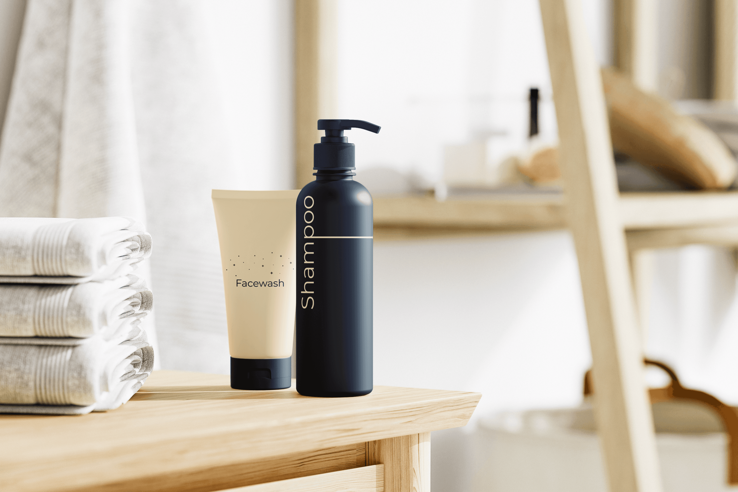
Typography – A clean, modern typeface that reflects the simplicity and clarity of the brand.
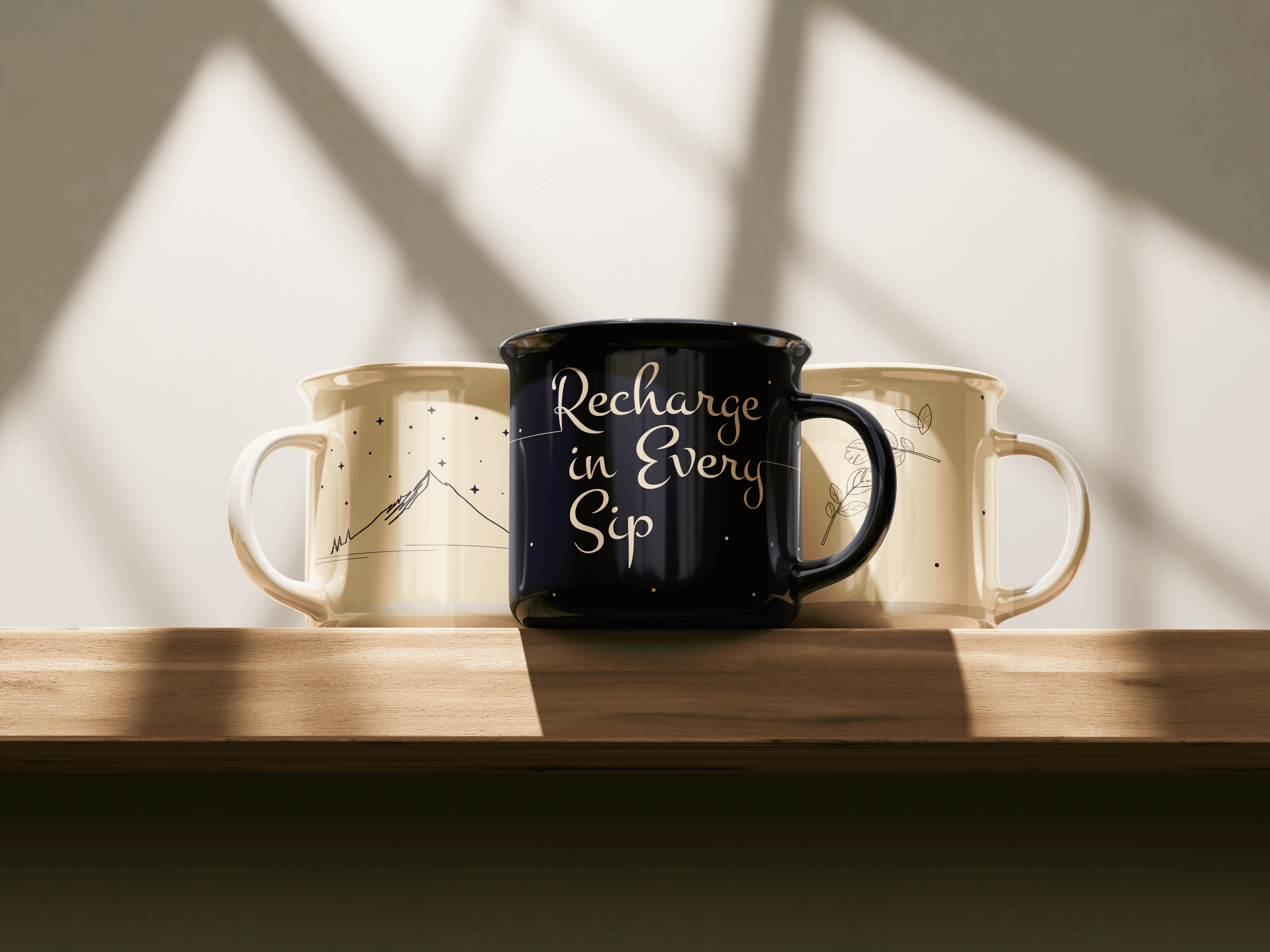
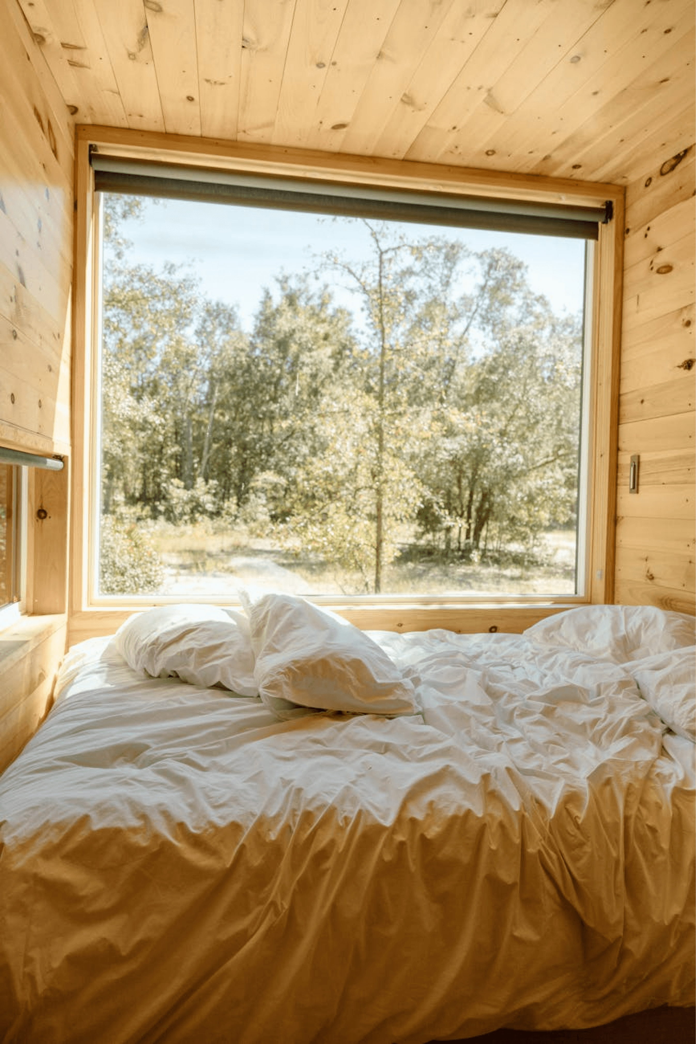
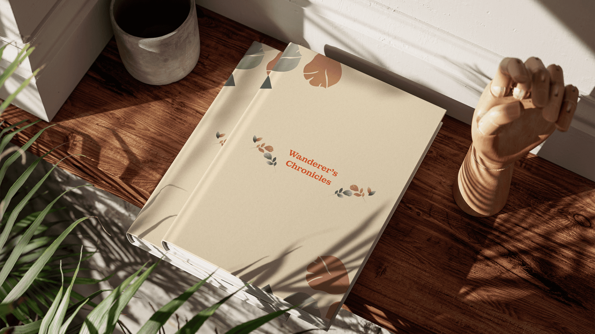
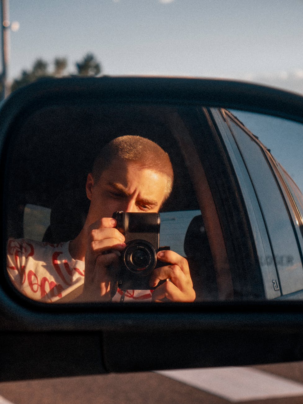
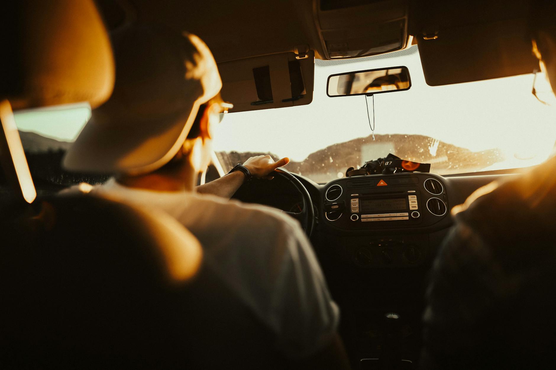
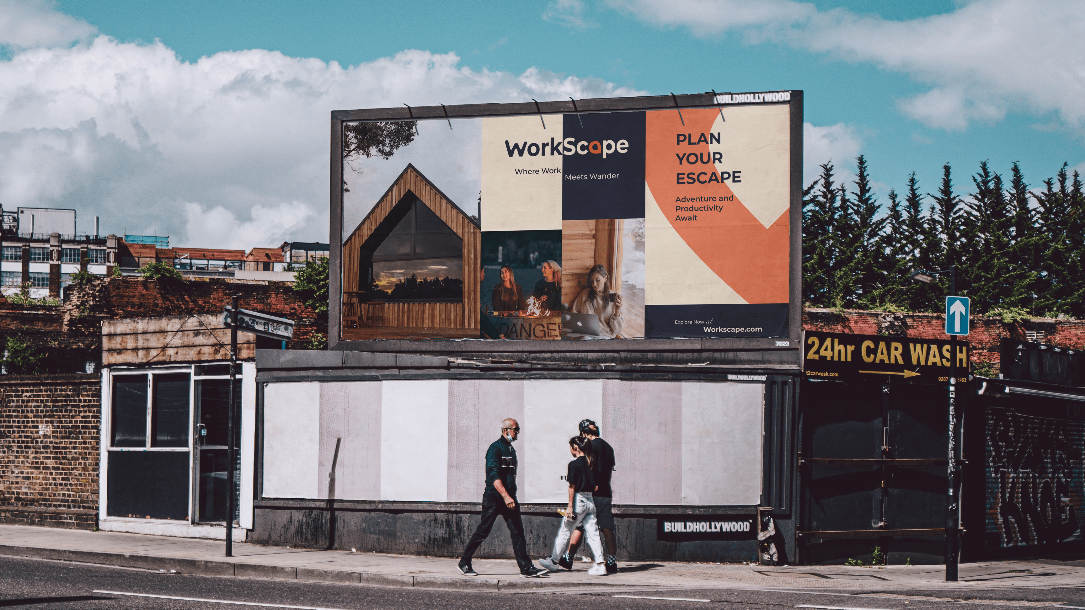
Imagery – A combination of work, travel, and lifestyle photography to tell a compelling story of work-life balance.
I wanted Workscape to evoke a sense of calm, inspiration, and adventure. The branding revolves around:
Logo – The Workscape logo, featuring a stylized "W" and a location pin, reflects the brand’s focus on productivity in inspiring locations. The "W" symbolizes work, while the location pin represents unique, serene workspaces. This design evokes exploration and balance, creating a strong, memorable identity that aligns with Workscape's mission to empower remote professionals.
Color Palette – A mix of warm neutrals, deep blues, and a vibrant accent to create a professional yet cozy feel.
Typography – A clean, modern typeface that reflects the simplicity and clarity of the brand.
Imagery – A combination of work, travel, and lifestyle photography to tell a compelling story of work-life balance.
Where Work Meets Wander
Where Work Meets Wander
Where Work Meets Wander
Where Work Meets Wander
#F45B28
#003049
#2F2F2F
#FFFFFF
#FDF0D5
#F45B28
#003049
#2F2F2F
#FFFFFF
#FDF0D5
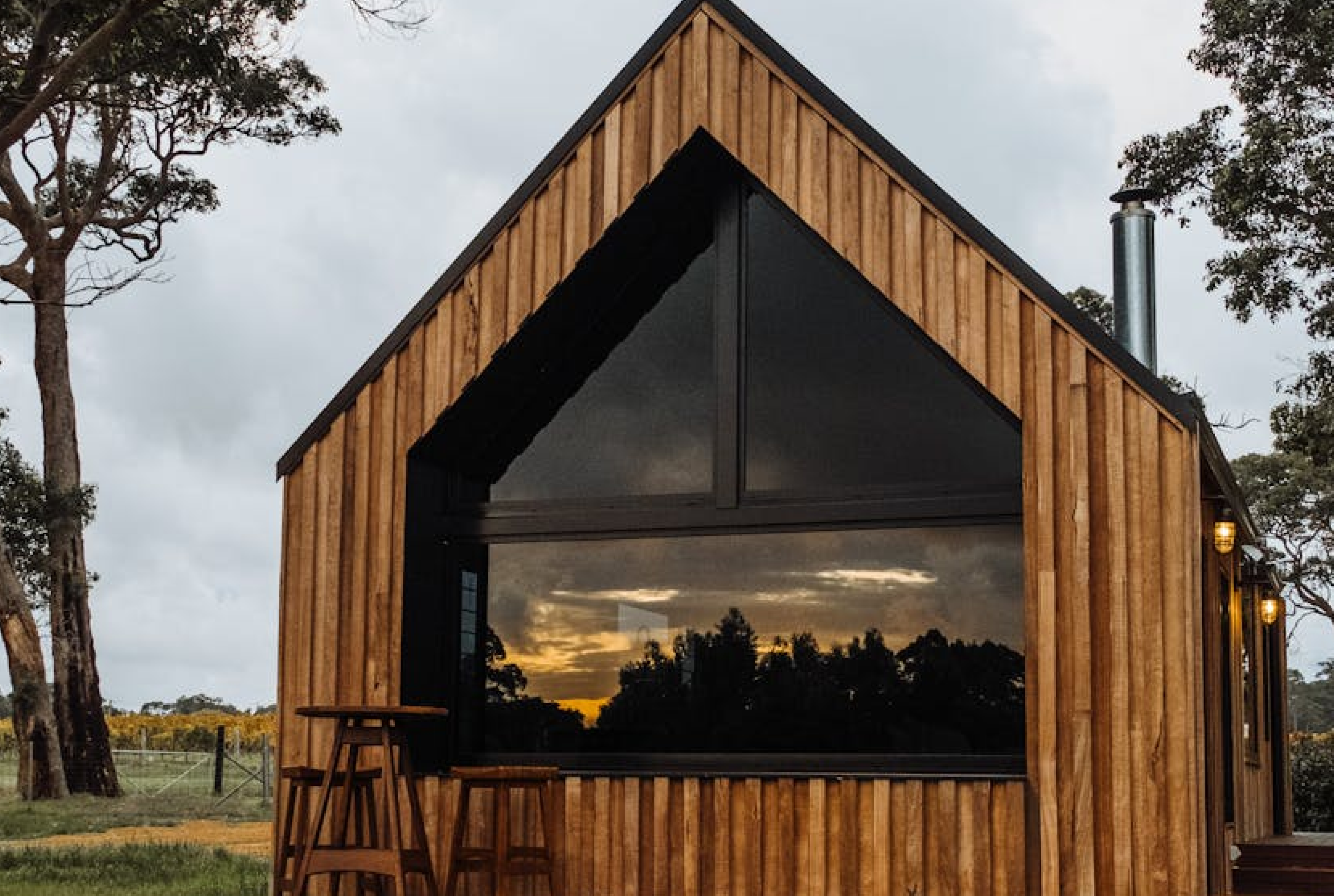
During breaks, individuals can recharge with activities like hiking, exploring new spots, or engaging in fun and relaxing experiences. By combining functionality with natural inspiration, Workscape empowers professionals to thrive in harmony with their surroundings.

Where Work Meets Wander
Where Work Meets Wander
Where Work Meets Wander
Where Work Meets Wander
Where Work Meets Wander
Where Work Meets Wander





Let’s create better experiences together.
Disha Bose
UI/UX Designer
© 2025 Disha Bose. All Right Reserved
Let’s create better experiences together.
Disha Bose
UI/UX Designer
© 2025 Disha Bose. All Right Reserved

Let’s create better experiences together.

Disha Bose
UI/UX Designer
© 2025 Disha Bose. All Right Reserved
Let’s create better experiences together.
Disha Bose
UI/UX Designer
© 2025 Disha Bose. All Right Reserved
Let’s create better experiences together.
Disha Bose
UI/UX Designer
© 2025 Disha Bose. All Right Reserved